Passion for Excellence
Keough Update #7: LABYRINTH SUBLIME
Printing Complete — February 12, 2011
Greetings Everyone
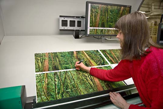
With great pleasure we report that LABYRINTH SUBLIME: THE INSIDE PASSAGE has been printed! Just a few hours ago Rosemarie gave the FINAL printing approval, this being for images of old-growth, cedar forest — the opening and closing “leaves” of LABYRINTH SUBLIME.

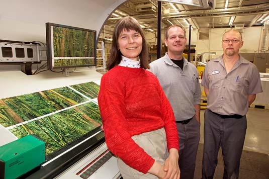
Rosemarie, head pressman Tim Klassen and assistant Ed Loewen smile from the viewing booth at the ManRolland press. The approval sheet behind them is also viewable on the computer monitor. Actually, Ed found it hard to smile at a camera without a photographer standing behind it! To take these photos, Rosemarie had set up her camera on a tripod and tripped the self-timer shutter release.

Try to imagine... The thick covers of LABYRINTH SUBLIME are clad with morocco (the highest-quality, goat, book leather) dyed a custom forest-green. Opening the tome reveals a rich-green flocked velvet for both the doublure (the cover interior, bounded by a leather border) and the flyleaf. Following this tactile experience and proceeding to the next pages (those which we just printed), one’s eyes can roam amid the complexity of the temperate rainforest via our imagery before coming to the certificate and title pages. The colour and textures of the leather and velvet are akin to the thick mosses and lichens draping the trees in our photos. To enter our tome in such a manner seemed appropriate because The Inside Passage is about the forest as well as the sea. Indeed much of the world’s remaining temperate rain forest is along The Inside Passage.
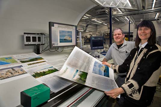
We should also tell you about yesterday’s approval: the most difficult sheet of the entire project. The effort and expense to attain the desired colour for this sheet was enormous. Indeed, this is the second time this sheet (front and back) has been printed, all sheets from the first attempt having been relegated to spoils. Yesterday’s efforts extended several hours and included shutting down the press when we simply could not attain correct colour on all four pages. The pressmen and Rosemarie were on standby while the pre-press expert was called in to modify the original computer files for particular images, after which a new set of printing plates were laser-etched and then installed. With the press rolling again, under the critical eye of Rosemarie and Tim, this time the desired results were attained. The smiles sported by Rosemarie and Tim are from the heart. No doubt this one sheet was THE most challenging we’ve ever encountered. Here’s why.

Take a look at the images on the sheet Rosemarie holds. Two pages are of text imposed over a full-page background image printed in pastel shades. Both are actually halves of two, double-page spreads. The other halves have already been printed. Thus the colour of the cross-overs on our sheet had to accurately match that of the previously-printed facing halves. (Cross-overs can’t always be printed on the same sheet because of collation configuration). Compounding the challenge is that there is a THIRD cross-over — half of the title page (on which you can see read LABYRINTH SUBLIME). This cross-over image had to match the right half of title page which had already been printed on another sheet (a copy lies at the top of the viewing booth, with the words THE INSIDE PASSAGE). We were working with very subtle coloration in three of the four pages on this sheet which is hard enough on its own to attain; and we were dealing with three separate halves of previously-printed cross-overs. Only one page offered slight colour manoeuvrability, that being the image (bottom right of the sheet) of a freighter headed up Puget Sound.
During the lithography we adjust colour and ink density. This can be done across the sheet, or selectively in vertical bands. Even when working selectively, the adjustment affects two of our images, the ones stacked above and below. Here in lies the art of balancing colour... required is eyesight that is extremely sensitive to minute colour changes, combined with an awareness of how the press works, CMYK colour theory, and of the colour matrix within the imagery. There is much that one can do to attain the colour desired. However, there can be impossible situations such as we recently experienced. With yesterday’s difficult sheet, although we had perfected the right two images, we then could correct either the top left, or the bottom left, but not both simultaneously. Two weeks ago we spent hours printing this same sheet, creating a large stack of printed paper none of which can be used in the book. Then yesterday we worked long and hard (read: expenses mount) during the re-print. As such it seems all too anti-climatic that the 350 sheets plus extras required for this project could be printed within a mere 15 minutes. At the conclusion Rosemarie said to Tim, “I think I could use a drink... even though I don’t drink.” In lieu of a professional handshake, Rosemarie gave a Salt Spring hug not just to Tim, but also to Ed. It was a challenging day for certain, but together we got there!
Before you raise a toast to the completion of the printing, be aware that there are yet several stages to be completed here at Friesens. Pat and Rosemarie are not yet ready to celebrate.
What’s next? Aqueous coating, both sides of our sheets, once several days have passed allowing the inks to dry thoroughly. We have several reasons for specifying a sealant, something that normally is only applied to book covers, not to pages. By the way, a similar sealant was used in ANTARCTICA. Here’s our reasons:
– to prevent "rub-off" of ink from one page to the facing page (given the weight factor of
LABYRINTH SUBLIME and ANTARCTICA without this coating, rub-off could be a concern)
– to provide additional UV protection
– to create a continuous, smooth and glossy surface across both the image and the bare paper
– to upgrade the finish to what is considered premium quality
– to provide a measure of protection should the pages be handled by dirty fingers
(finger prints can be wiped off with a soft cloth)
– not prone to yellowing through time as is varnish
– water-based product, much more environmentally friendly than varnish
Earlier this week the aqueous process was started on Friesens’ 6-colour Heidelberg Speedmaster 740 mounted with the coating unit. Despite make-ready extending from about 3:00 p.m. through midnight, Rosemarie did not give her approval and requested the process be shut down. This was quite a disappointment. To address the problem Rosemarie spotted, over the past days Friesens has been conducting tests and doing research drawing on the collective wisdom of their long-term employees (many with 20+ years experience) also consulting with industry experts. Later today another test is to take place, the success of which will dictate the next steps. We are very impressed with Friesens’ determination to ensure that the coating is exactly what we want. The can-do attitude speaks volumes about the integrity of this firm. Rest assured, the project is in very good hands. Indeed many hands may just be the solution. That’s a clue toward the test being done today. While we thought we’d have completed the coating, trimming, collating, and inspection phases by Valentines Day, the reality is that we’ll be working in Altona for quite a bit longer. Once all tests are complete and we have progressed, I’ll be back with a subsequent report.
Meantime, here’s a bit more insight to the local culture and history here in southern Manitoba.
Friesens is a common name in these parts, although not all Friesens are related. Their ancestors hail from Friesland, Netherlands. During the Reformation, similar to how followers of Martin Luther (born 1483, Germany) became known as Lutherans, followers of Menno Simons (born 1496, Friesland) became Mennonites. Interestingly Luther considered Mennonites to be schismatic heretics because of their belief in adult baptism rather than infant baptism.

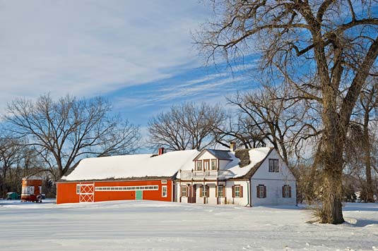
Earlier this week I took a drive through the countryside, enjoying the scenery and taking a few photos. This white house and red barn is actually the Friesen’s house-barn in the Mennonite heritage village of Neubergthal, a short distance southeast of Altona. By late afternoon, the lowering southwest winter sun was casting a warm, soft light, one that flattered the white planks of the house as well as the red siding of the barn. I realized that all the elements had come together for a fine composition — a wedge of cloud visually balancing the weight of the snow; the accent of blue sky augmenting the accent of the red barn with its green door; the orderly architecture with neat porch posts, windows, even the diamond pattern on the larger barn door, contrasted with the wild limbs of the bare trees; the linearity of the building harmonizes with parallel shadows falling across the snowfield; etc etc. All of this was enhanced by what I considered to be perfect light which even illuminated the rough-textured bark on the foreground tree. Yes, I was well content with this image. Enjoy!
About Mennonite house-barns and Neubergthal (www.neubergthal.ca): Neubergthal is one of the best-preserved single street Mennonite villages in North America. The village layout and architecture was developed over centuries of Mennonite life in Europe and Russia. Many of the present villagers are descendants of the first settlers, and most still speak Low German. Vital aspects of 130 years of community life continue. Long, narrow farmsteads are perpendicular to the single street of the village. All homes consist of a house and barn connected together with main doors facing south, containing a central brick heater with four of five rooms around it. Barns had a predictable layout for stabling animals, and for storing feed fuel, harnesses, and tools. Street villages kept neighbours and families close together, and encouraged social cohesion and cooperative efforts.
Signing off for today. I’ll be back in touch shortly!
From Pat and myself,
Very best wishes to all,
Rosemarie