Passion for Excellence
Keough Update #8: LABYRINTH SUBLIME
Aqueous Starts and Stops — February 17, 2011
Greetings Everyone
The progress in the creation of LABYRINTH SUBLIME this past week has been interesting to say the least... and certainly not what was anticipated. There are delays due to challenges I’ll explain.
First, I thought you might like to see what Friesens looks like from the exterior. The extensive grounds face a residential neighbourhood and are graced by large trees — large by prairie standards.
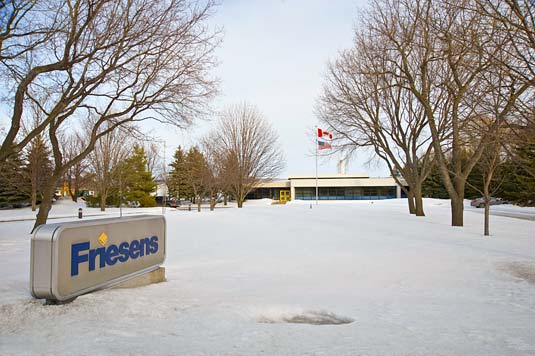
Friesens Corporation’s colours are blue and yellow, which you see on their logo, signage and exterior colour accents of their head office. I wouldn’t be surprised should spring and summer blossoms be pink or red, which together with the yellow doors, blue panels and black window frames, would complete the CMYK printer’s quartet. CMYK is the acronym for Cyan (which is sort of like blue), Magenta (rather like red), Yellow and BlacK. These four inks printed as small dots positioned in close proximity can create an illusion of the majority of all colours. My guess is that the Friesens corporate colours were selected, intentionally or subliminally, in appreciation for the beauty of Altona’s former vast fields of sunflowers and year-round, often clear-blue skies. Altona is known as the Sunflower Capital of Canada, and as you approach town, you can’t miss the the world’s “Largest Painting on an Easel” — a giant replica of Vincent Van Gogh’s Sunflowers, nearly 80 feet high! I mention the fields being former, as sunflower (used for cooking oil) of recent has been supplanted by canola (previously called rapeseed until marketers presented the advantages of a new name.)
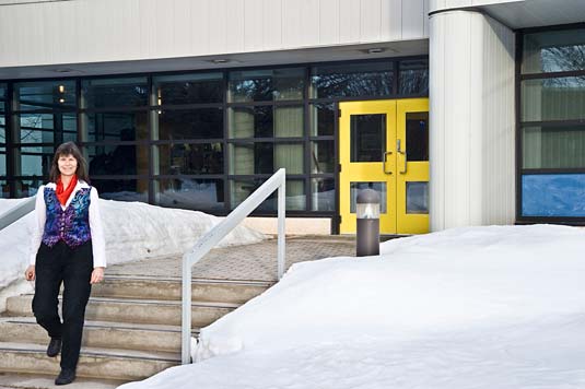
Here I am at the entrance to Friesens Corporation. The administrative offices are in front, connected via the cafeteria to the printing plant. This is another self-timed photo, with my camera on a tripod. I clicked the shutter and within the allowed 10 seconds, ran into position, and attempted to look natural.
Today’s progress report picks up where we left off a week ago — near midnight when I called a halt to the make-ready of the aqueous coating after hours of effort.
Some eighteen hours earlier, Guy Dupuis and his helper Kevin commenced an entire shift of maintenance on the Heidelberg Speedmaster 740 press followed by preparations in advance of the coating of our printed sheets, the next stage in the making of LABYRINTH SUBLIME.
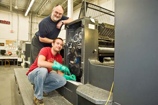
In these two photos the facer plate has been removed from the coating unit, to allow access to the mechanics within. Kevin, sporting green rubber gloves, is scaling and removing hardened aqueous coating (in a funny way, a little reminiscent of a visit to the dentist for a cleaning).
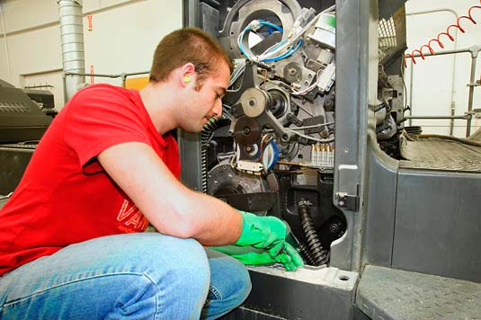
Below Kevin washes the aqueous blanket removing any residual debris that if undetected, would result in a blemish, akin in appearance to a blister, on the aqueous-coated sheets.
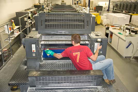
This Heidelberg press is huge: some 60 feet from front to end. There are six inking units followed by the coating unit, then a long stretch (on which I’m standing to take the photo above) housing 24-carrot-gold-filament heaters that flash dry the aqueous-coated sheets just prior to their being stacked at the end of the press. Without these heavy-duty heaters the sheets would glue together.
To ensure the highest quality for LABYRINTH SUBLIME, the Friesens production team decided to “dry-trap” our pages — to print the images first on the Man Rolland press, to allow the inks to dry thoroughly over a week and then to apply the sealant using the Heidelberg press. Friesens tells us that application of aqueous coating to every page within a book is unheard of; the expense justifiable for a book’s cover and/or dust jacket. For our large tomes, we seek the protection that aqueous can give to all our pages, protection as described to you in the last update. We did the same for ANTARCTICA wherein every page has been completely sealed.
For LABYRINTH SUBLIME, the six inking units of the Heidelberg are intentionally dry and serve the purpose of removing “printer’s powder” from our printed sheets. This powder, a fine cornstarch, was twice blown between our sheets during the original lithography, as is routine when printing the front and then the reverse sides of sheets. The powder’s purpose is to prevent the wet ink of one sheet from sticking to the underside of the sheet above when stacked at the end of the press. Fast forward to the next stage, aqueous coating, this powder needs to be removed prior to the application of the sealant. We don’t want powder trapped between the sealant and the paper.
So why at midnight a week ago did I shut down the press by declining to approve the aqueous coating of LABYRINTH SUBLIME? Despite all best efforts to ensure not a single blemish in the gloss finish, I noted something of concern, something I had never seen before, something the pressmen hadn’t been aware, something that occurred for reasons we’ve not been able to fully explain even after a week of research.
When running a hand across the make-ready sheets, the feel of the aqueous immediately atop the photographs was not smooth whereas it was over the white (bare paper) portions of the pages. Indeed, I would describe the texture as being rough. Others would say this tactile differentiation to be within industry standards. However, our goal for this project, like that of ANTARCTICA, is attain 100%. We are realistic enough to be satisfied if in giving our best to attain this goal, we reach 98%. Minimum industry standards for any portion of this project is simply unacceptable. Hence, I called for a halt to the coating of our printed sheets.
Exhausting variables, we determined the aqueous process is perfectly fine. The source of the roughness lies with the original printing of the reverse side of our sheets. At that stage, printer’s powder adhered to the drying ink — a most unusual situation. Under magnification, one can actually see bumps atop our photographs, a texture which is then accentuated by the aqueous. We hadn’t noticed this problem during the approvals of the printed pages earlier because the inks at that stage were wet enough to smear and as best we could we avoided touching them. We also had no previous frame-of-reference to alert us to watch for such a problem. A decade and more ago, inks were petroleum based and included effective drying agents, none of which were particularly environmentally friendly. These inks dried quite quickly, at least to the touch. Today’s inks used by Friesens are vegetable based with little or no drying additives. The combination of our light-fast inks (not normally used by Friesens), the very heavy paper stock (definitely not the usual for printing books), perhaps our short runs (with the press never really heating up to full temperature) and other undetermined factors lead to the challenge we’re resolving today. Rather than spending more time determining exactly why this happened, we’re focussing on how best to deal with the situation. For an unexpected wrinkle, this is a major one, but I am confident in the Friesens team.
A project with the level of quality of LABYRINTH SUBLIME is bound to hit a few rough spots along the way (pun is intended) despite best efforts of all involved. The integrity of a company is determined not by how well a relationship functions when everything is smooth; but rather by actions during difficulties. I must say that Friesens is admirable in every way. Our concerns have been treated with respect. There is a very positive response by all involved to deal with the situation. Already one solution has been found. However, this initial solution involves an estimated 1300 to 1800 hours of hand buffing the rough sections on one side of each of our 40,000 sheets. Yes... and realistically it isn’t possible for people to hand-buff non-stop for a full shift — yesterday this was attempted as a trial. Friesens is working on several fronts, and will take this next week or two to determine a practical solution. From Curwin Friesen, the company’s President and CEO, to Byron Loeppky, Plant Manager, to the engineers and pressmen... everyone is applying their full support. Curwin suggested, and I agreed, that it would be advantageous for me to return to home to Salt Spring Island until the final workable solution is implemented.
I leave Altona in a few hours, glad to return to my Pat. I leave with the confidence that LABYRINTH SUBLIME is receiving the priority attention required. I dare say that many another printing company might have said, “Keoughs, your demands are simply too much.” Friesens has accepted the challenge from the outset and they are giving it their all.
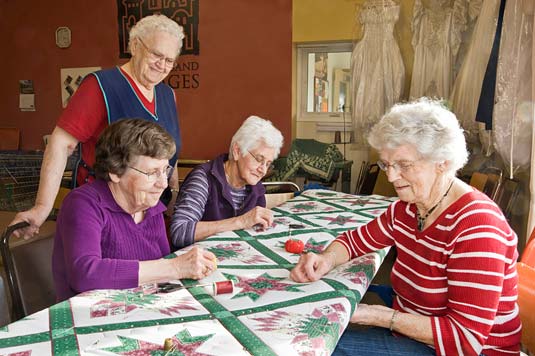
Before signing off, I’d like to share two Manitoba photos which I took yesterday and the evening before. I had stopped by the Mennonite Central Committee, a social centre and thrift shop where Low German is heard as frequently as English. Children call the MCC the treasure store. The elderly claim it as a second home. For a few cents or dollars everything from clothing to left-over building supplies can be obtained. Anything of possible use is donated — including pockets from worn blue jeans; left-over half-roll of drywall tape; heating elements from stove tops etc. I purchased a brand new canning pot for $4 and three Vogue clothing patterns at 25 cents each which perhaps one day I can sew. One entire room is dedicated to quilting, and this is where elderly women chat while make quilts using donated materials. The finished quilts and comforters are sent to the MCC headquarters, where they are baled and shipped to where ever in the world they may be needed by those less fortunate.
And I conclude this update with a prairie sunset! Enjoy!

With our very best wishes,
Rosemarie and Pat